Circle K Redesign
Circle K had their redesign done in 2015 which seen the combination of stores they acquired into one logo, including Mac’s, Statoil, Kangaroo Express, and the already existing Circle K themselves. My task 5 years later was to produce 3 redesigns of the Circle K logo, including a banner, each trying to achieve the same goals of unity, wholeness, and teams.
Made with Affinity Photoshop
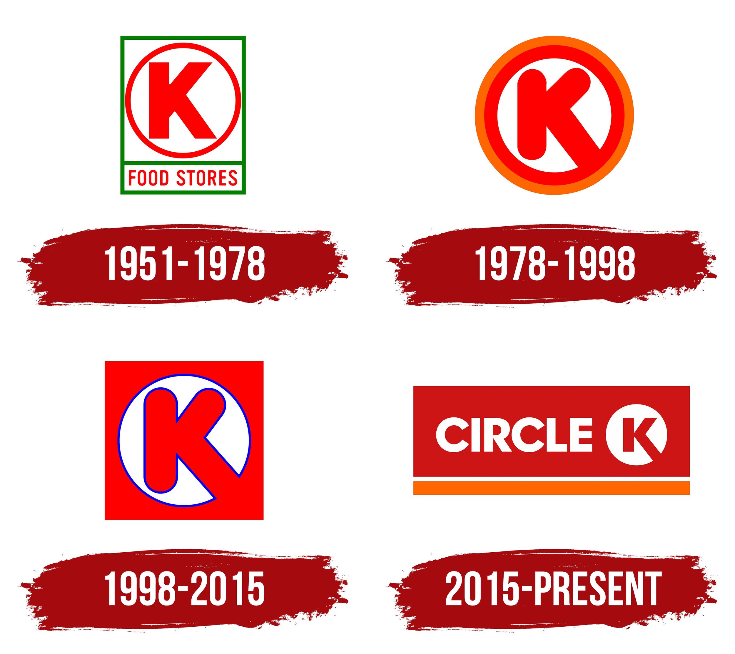
History of the Circle K Logo
Video of the New Logo Creation
The video here is what I was shown for the construction of the the creation of the current logo of Circle K
Combination of All the Logos
The first logo I tried to combine the iconic winking of the Mac’s Owl logo, the kangaroo of Kangaroo Express, the bubbly and lively font of the old Circle K logo, and the colour theme of Statoil.
C-curl K
This logo plays on the idea of what the new logo is achieving, but this logo makes it more cohesive with each element.
Intertwined
The final logo deals making the K more intertwined and connected with the wording and the space used.


